aesop nolita
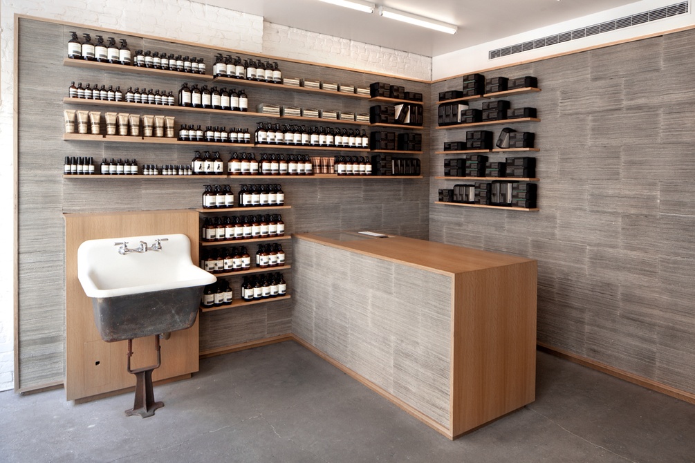
in the design of aesop’s first store in new york city – a market that is often dictated by retail trends that seemingly come and go overnight – we sought to create a place that is defined by a slow material measure of time.
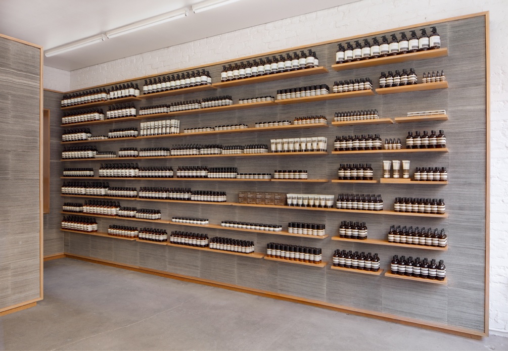
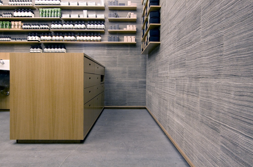
beginning with an idea initiated in the aesop kiosk – which uses text in the form of a newspaper to mark a place of information and orientation – the design for elizabeth street turns the text of the newspaper inward and focuses on its materiality, creating newsprint walls that will age over time. here 2,800 new york times newspapers have been cut into 400,000 strips which were then stacked and bound
to create a soft, felt-like surface held within a continuous oak wrapper. just as oak is commonly used to store and age wine and spirits, so too will the newspaper age, turning a light tan, thus marking the passing of time. in this way, the history of aesop north america will be recorded within the very walls of this first store.
photos: juliana sohn, tacklebox architecture and gianluca fellini for aesop


